Logomark and Logotypes
The logomark and logotypes of the National Art Center, Tokyo have been in use since the facility’s formal establishment on 1 July 2006 under the auspices of the Independent Administrative Institution National Museum of Art. They were designed by Kashiwa Sato who has been creative director for many corporate and institutional projects both in and outside Japan.
- Logomark
- Logotypes
-
Design Concept
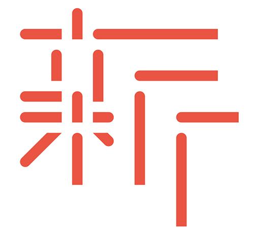
If one kanji (written character) were to represent the National Art Center, Tokyo it would be exactly “新 (shin),” meaning “new” [this word appears in the full Japanese title of the center].
The character “新” used for the design motif encapsulates the facility’s purpose: to serve as an art center for engaging in multifarious innovations and advanced creative activities. A readily recognizable character was deliberately chosen to make the center seem accessible and familiar to a wide audience, especially those usually indifferent to art. All the elements, the lines, that make up the character “新” have been detached and left open—appropriate for an open “new site.” The design reflects the idea of the National Art Center, Tokyo as a window open to the communication of all kinds of art information, allowing new relationships to form between art and society, art and people, and thus contribute to their future. The logomark, a fusion of straight lines and curves, also mirrors the form of the building itself, which integrates curved glass-curtain walls, a striking architectural feature, with exhibition spaces composed of straight lines. Furthermore, the logomark’s separate elements represent the movable partition system used for the large exhibition space—protean and fully flexible, another characteristic of the National Art Center, Tokyo.
The basic logo employs hi-iro (scarlet color) and keshizumi-iro (cinder color), traditional Japanese colors incorporated in the design of the National Art Center, Tokyo by architect Kisho Kurokawa. Shades of red were chosen also to evoke something new, vivid, vigorous, and impactful so as to integrate with the architecture and the facility’s purpose of interacting with society. While hi-iro and keshizumi-iro are the standard colors, they are not prescriptive. The logo can employ color variations; it is meant to be unrestricted and free. This radical approach to color branding is unique to the National Art Center, Tokyo: a setting ready to embrace a wide variety of projects and not defined by the contents of a single collection.
Message from the Designer:
A New, More Open Relationship between People and Art
The National Art Center, Tokyo, the fifth state-owned institution of art in Japan, unlike the usual museum, does not have a permanent collection. Instead, it provides a site for many different kinds of exhibitions, its activities characterized by a high degree of freedom. Not bound by conventional categories, it seeks new ways of fulfilling the role of an art facility, as an accessible site that attracts a large volume of information on art brought in by all sorts of participants, a place where people can gather and take away what they have received. The unique and imposing architectural form to emerge in Roppongi symbolizes this new approach. It is big news for the Japanese art scene and society and almost certainly, indeed inevitably, will have a major impact. To my mind, as I embarked on this project, the logomark and logotypes of The National Art Center, Tokyo needed to encapsulate and express “novelty,” “progressiveness,” “originality,” and “a spirit of continuous evolution.” I designed the logo with the intention of distilling the aspirations of those involved in the establishment of the facility and conveying a message from the Japanese art world to society at large—a message that reflects the present and foreshadows the future.
(Kashiwa Sato, July 2006)
Profile
- Kashiwa Sato
- Creative Director
Kashiwa Sato is a leading creative figure in Japan who brings fresh perspectives on today’s global society. Born in Tokyo in 1965, he is a graduate of the Department of Graphic Design at Tama Art University. After a period of employment at Hakuhodo Inc., a prominent Japanese advertising company, he started his own independent business in 2000, establishing the creative studio SAMURAI the same year. As a brand strategy architect he has earned high regard in a variety of fields for consistent, comprehensive work distinguished by a powerful creativity—from conception development and the design of communication planning to visual development.
Among his major projects have been logo design for the National Art Center, Tokyo and the Tokyo Metropolitan Symphony Orchestra; creative direction in branding for Uniqlo Co., Ltd., 7-Eleven Inc., the Rakuten Group, and the Imabari Towel Industrial Association; and total branding design for Fuji Kindergarten and Yokohama’s CupNoodles Museum. In recent years his work has expanded to include such large-scale architectural projects as the Takeda Global Headquarters and Nissin Food Products Co., Ltd.’s Kansai factory.
Sato was appointed a Japan Cultural Envoy by the Agency for the Cultural Affairs of Japan for 2016 with a focus on deepening and broadening international understanding of Japan’s quality products, culture, techniques, content, and so forth.
These are just a few of the books he has authored: Kashiwa Sato's Ultimate Method for Reaching the Essentials (Nikkei Business Bunko), Kiki-jozu hanashi-jozu [Good listener, skilled talker] (Shueisha), and Sato Kashiwa on Meetings: Achieving Breakthroughs in Your Conventional Meetings (Daiyamondo-sha).
Among his many awards are the Mainichi Design Prize, the Tokyo ADC Award (Grand Prix), the Tokyo TDC Prize (Gold Prize), the Asahi Advertising Award (Grand Prix), the Kamekura Yusaku Award, and the Japan Package Design Award.
In 2021, solo exhibition “KASHIWA SATO” was held at The National Art Center, Tokyo.
Official website:kashiwasato.com
